Inclusive Brainstorming
The practice of human-centered design can be challenging. Above all else, designers in this field must maintain focus on the user, which is more difficult than it seems. What happens when the target user has vastly different day-to-day experiences than the designers? Several members of our team had our human-centered skills put to the test with such a challenge recently.
Philly Link is an organization serving the communities of people with disabilities and older adults in Philadelphia. Our team was invited by Philly Link to help clarify and communicate the needs of their diverse audiences to a group of programmers and designers attending a hackathon to build apps and devices for older adults and people with disabilities. We knew the young, able-bodied hackathon attendees might make a lot of assumptions about what Philly Link’s target users actually need and wind up building things that weren’t that useful. As we found out, we had a number of our own assumptions to adjust as well.

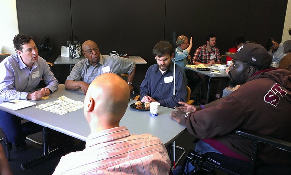
We held a design session to gather input from Philly Link’s constituents. The project lead, Faith Haeussler, did a fantastic job of gathering a diverse group of participants, which included two people who were visually impaired, three people who were deaf, three people who use wheelchairs, several older adults, one person with Parkinson’s, and several assistants. This was by far the most diverse range of abilities in a group the Action Mill had ever lead through a design process.
Redesigning brainstorming
Our go-to brainstorming tool is called Action Storming. This exercise has repeatedly proven to be a great way for groups to surface the knowledge they don’t know they have, and quickly generate both ideas and themes for new projects. The method requires the group to generate a lot of ideas on a particular theme, and then cluster them to create larger themes. However, as with many brainstorming methods, in order to make use of this activity, you need to be able to see and hear.
Being as inclusive as possible for this session was the top priority for Philly Link, so we had to find an alternative tool. We adapted a format called a Knowledge Café to help the participants have expansive, diverging discussions. With this tool, participants are organized into several smaller groups to discuss a particular topic or question for a brief amount of time. When that time is up, the small groups break up and participants form new groups for a new discussion. By continuing this cycle several times, a large group can have a lot of smaller conversations where participants get the chance to dig deep into their experiences, and incorporate other’s perspectives into their responses.
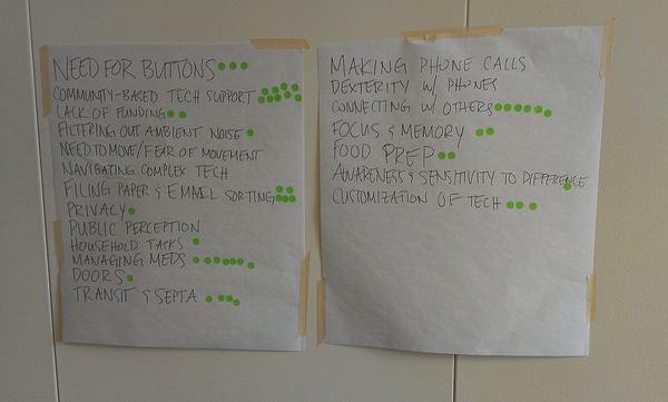
On the day of the design session, we facilitated the group through this activity, and had our assistants capture the ideas voiced on post-its. During a break from the group work, our design team and assistants sorted and clustered the ideas into themes. We presented them back to the group and talked about anything that might have been overlooked, and how to describe the themes in the words of our participants. We generated a new list of these themes, and as a final step the participants voted on which themes or clusters of ideas were most pressing, by adding stickers to the list.

What we learned
Not surprisingly, people appreciate being asked for their input on the issues that affect them. Our participants had a lot of ideas and perspectives to offer, and enjoyed sharing them in a focused time and place with others. Though not everything went perfectly, as I’ll detail below, our participants understood our mission to incorporate their perspectives and needs as best we could, and responded openly and graciously. This underlined for us once again a fundamental principle of our work: genuinely asking for input from users is the most important thing you can do in design.
And there are plenty of ways we’ll improve on this process the next time we use it. It turned out the Knowledge Café format allowed people with impaired sight more opportunity to contribute to the ideas generated, but people with hearing difficulties had trouble focusing on their individual group conversations amid the ambient noise of the room. As the main facilitator, I also couldn’t project my voice loud enough for everyone to hear consistently – having a microphone would have helped. Moving around from table to table was also a challenge for the people with impaired vision and different levels of mobility. Giving participants more time to review documents in advance would have made the session easier for people who use screen readers.
Results: The group had a very productive discussion, and came up with themes and ideas that resonated with many participants. Using the prompting question “What is a task that you put off or dread, (and why)?” we got some great responses that clarified some of the everyday problems these constituents struggle with.
As an able-bodied person, the themes that emerged which surprised me were:
1) The importance of buttons. Touch screen innovation has gotten rid of buttons which visually impaired people rely on for feedback.
2) Modern cell phones can be difficult to use for many people. Holding the phone for a call, holding the phone to take a picture, and keeping up with fast-paced directions in a phone system, all pose recurring challenges.
3) Sorting, reading, and accessing a wide variety of paper and emailed documents is daunting. Photos of documents aren’t accessible via screen reader, people with dexterity, mobility, and visual impairments have trouble opening, reading, and filing these papers to access them easily.
You can see more detail about the themes and specific issues in the notes we generated in these photos.
The last step of voting on themes also provided valuable insight. Though we discussed a variety of technical minutiae, the top themes involved people and their connection to one another. The two most pressing themes for our group were:
1) lack of connection and
2) a need for community-based tech support to provide a way for differently abled people to help one another find answers and troubleshoot technical issues.
One final surprise I had in planning the session was how few online tools (such as event invitations and collaborative platforms) are accessible via screen reader*. A screen reader is a tool used by people with mobility and visual impairments alike, and therefore fills the need of a large number of users. Given that everyone will age and probably experience impairments to their sight and movement, it’s hard to believe these tools aren’t more accommodating already. As we know from the world of design, this is just an opportunity waiting to be addressed with a great new product or solution. With the hackathon in the pipeline we left our session excited to see what new products and services will be created. You can read more details about the outcomes of the hackathon here, which turned out to be a great success.
*For our purposes, we were able to use Survey Gizmo to create an invite and surveys for our participants that were accessible. We made sure to use only text box fields and drop-down menus, as the radio buttons were problematic, but overall the accessibility of this tool was very high, as indicated by the Wave accessibility tool.
- Georgia Guthrie's blog
- Log in to post comments

